Background
Bishop Seabury Academy is an independent, college preparatory school in Lawrence, Kansas, that promotes individual academic growth and character development through a curriculum rooted in moral principles. It opened in 1997 and is an Episcopal school that welcomes students of all faiths.
Challenge
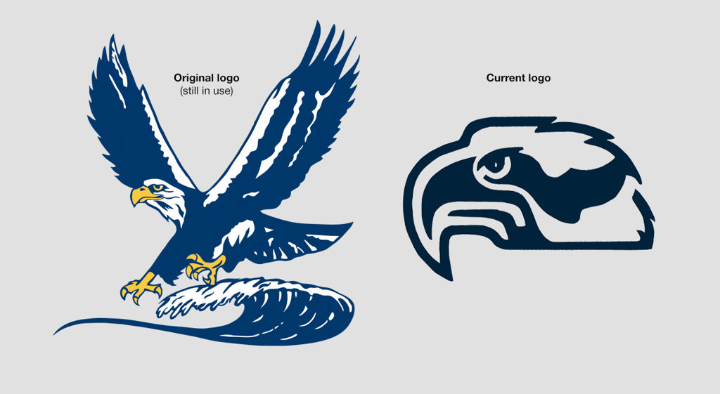
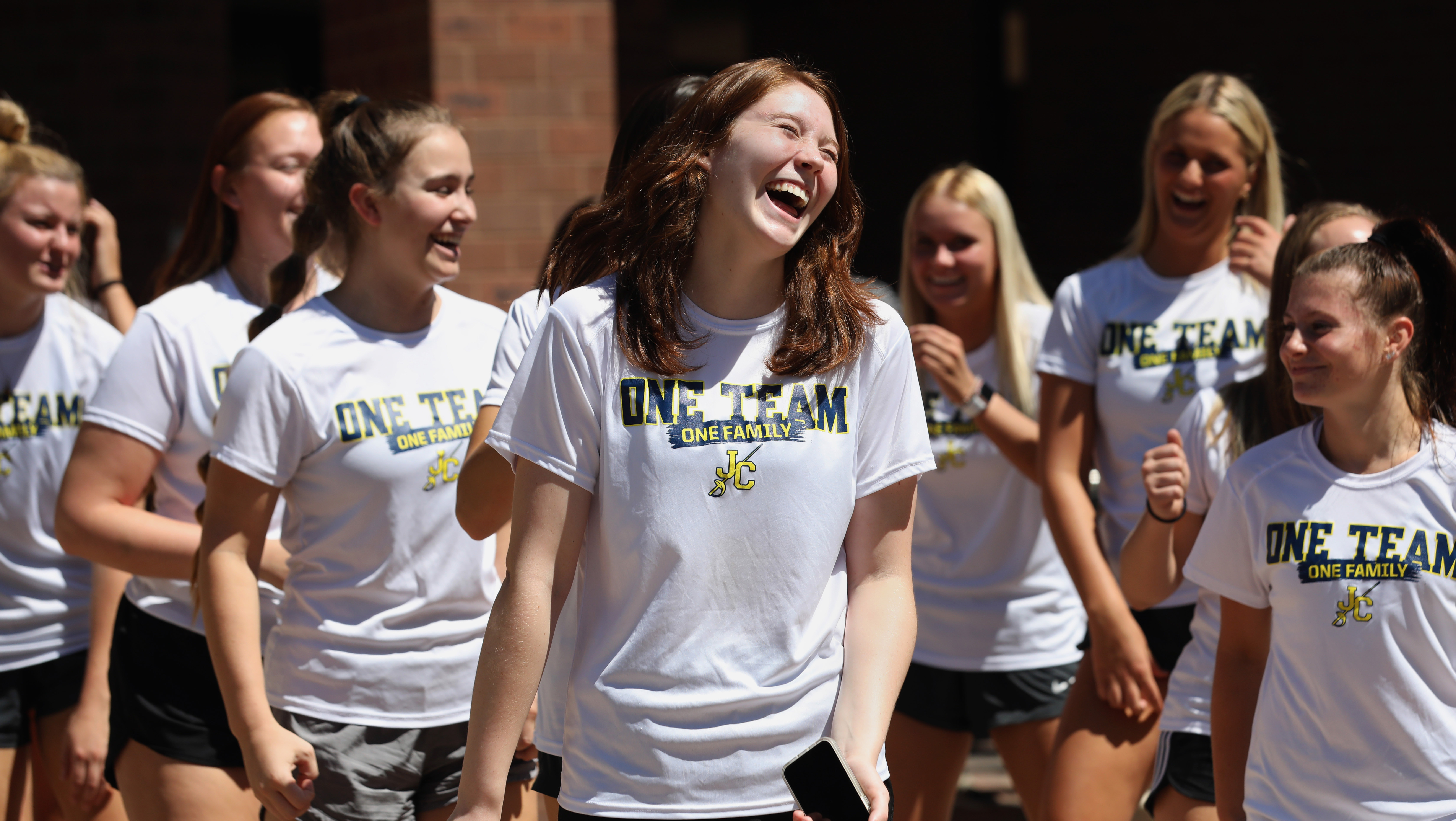
Develop a new logo that replaces current, disparate logos of the Seahawk mascot. The new mark helped unify school athletic team apparel, spirit wear and graphic uses on campus and promotional materials as Seabury prepared for its 20th anniversary in 2017.
Solution
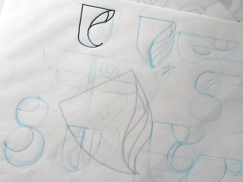
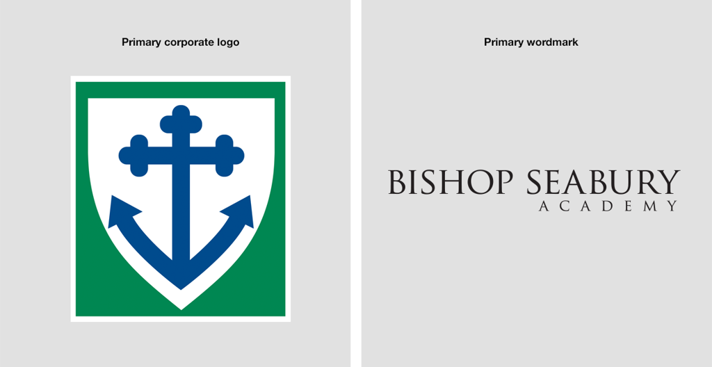
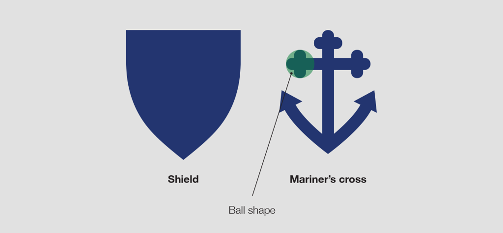
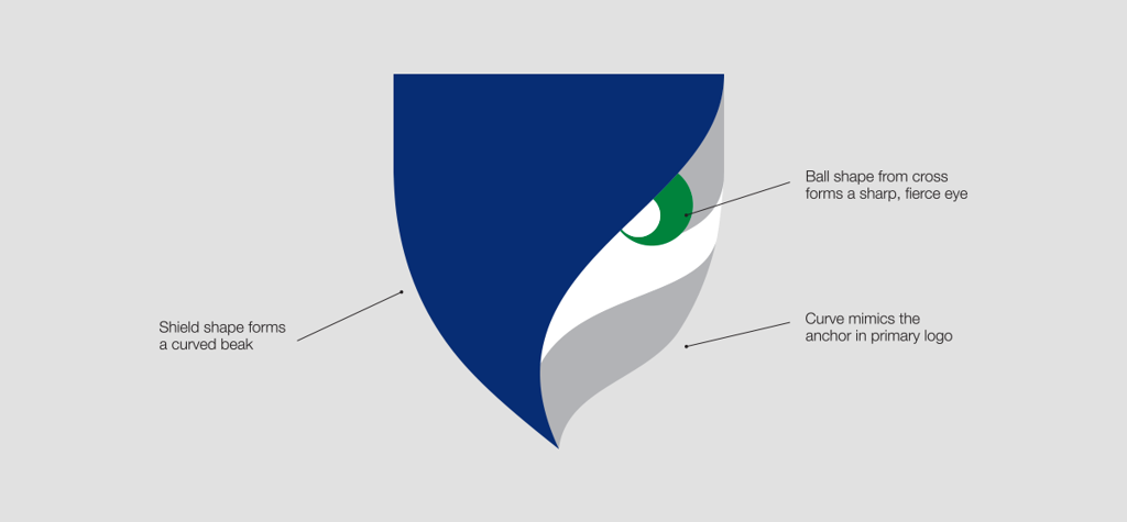
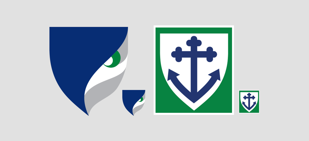
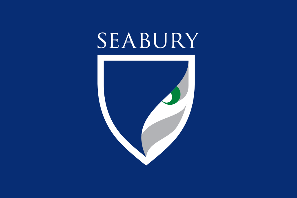
The strength of Seabury’s primary logo, a shield with a Mariner’s cross, is a solid foundation. The elements were deconstructed and used to guide development of a mascot mark that better aligned with the primary logo.
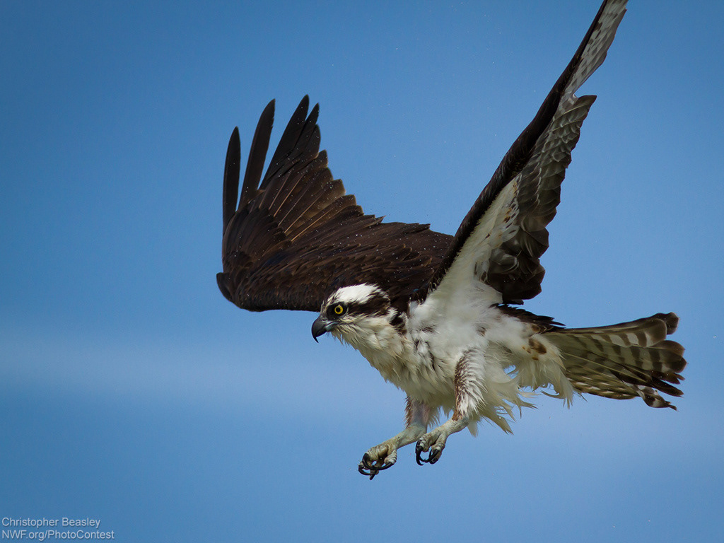
Previous versions of the mascot didn’t feel intimidating enough, and the client wanted something “more fierce.” The old marks were profile views and didn’t highlight the key features of a seahawk: the curved beak, the penetrating eyes, and the talons, which are used to grab fish from the water on high-speed dives.
Because the primary anchor cross logo was a front view, I focused on a face-forward view of the Seabury Seahawk. The shield was carved into a curved beak, the radius of the three balls on the ends of the Mariner’s cross was used to create an eye, and the feathers in the face were curved upward to mimic the hook of the anchor cross. The pupil of the eye was styled in the shape of a talon.
The Trajan typeface, which is used primarily with the shield logo in Seabury communications, was recommended for use with the new mark to improve consistency of brand impression, particularly with athletic apparel, which used several typographic combinations. Usage of the school’s name across channels has been fractured. I recommended using “Seabury” in all athletic uses to simplify communication and graphic applications.
Art direction and design // Chris Ralston