Background
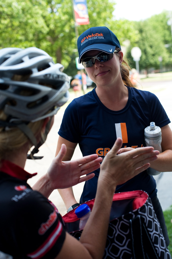
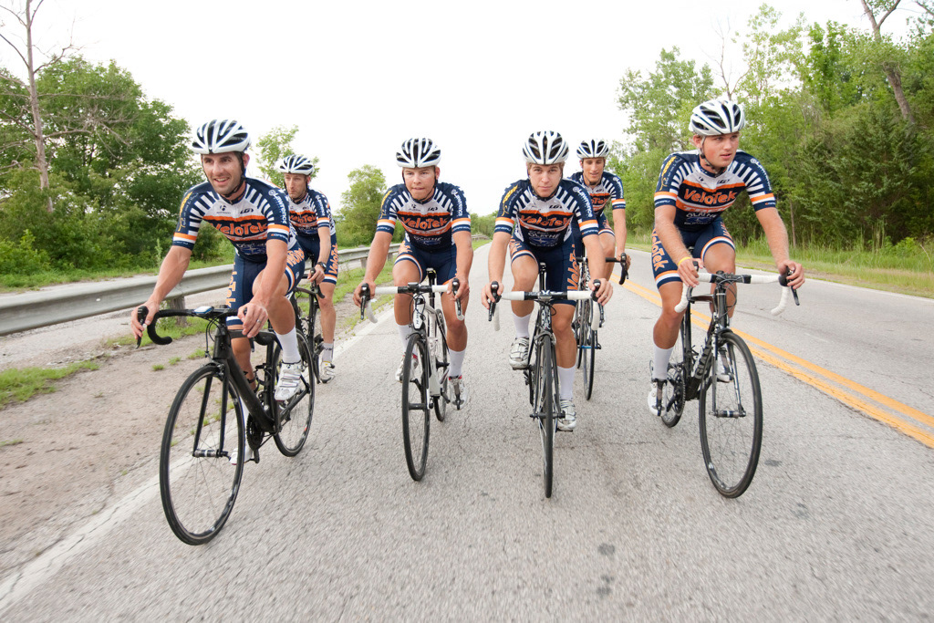
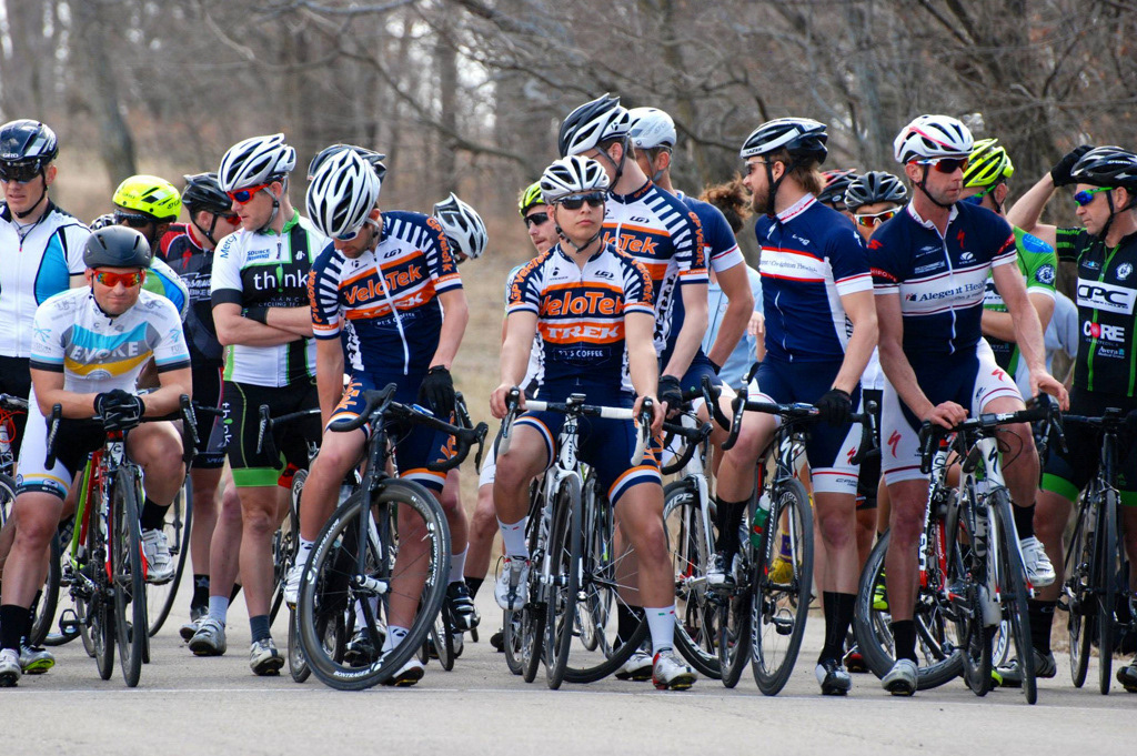
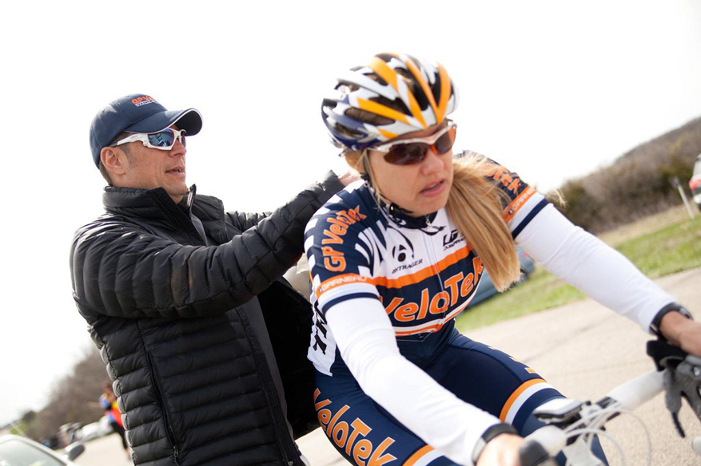
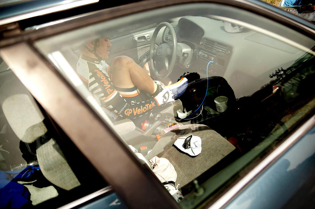
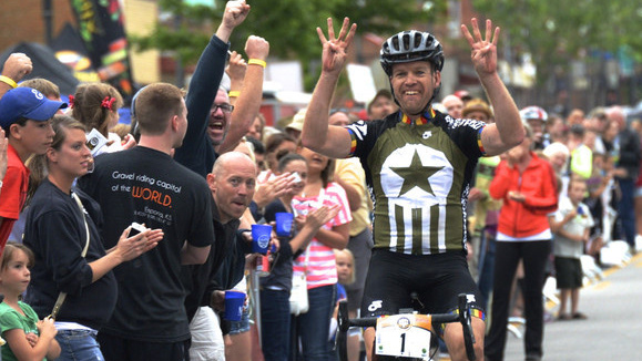
GP VeloTek is an amateur bicycle racing team based in Lawrence, Kansas, with more than 50 members from ages 8 to 65. Based in Lawrence, Kansas City and Topeka, riders compete locally and regionally in road and cyclocross events.
Challenge
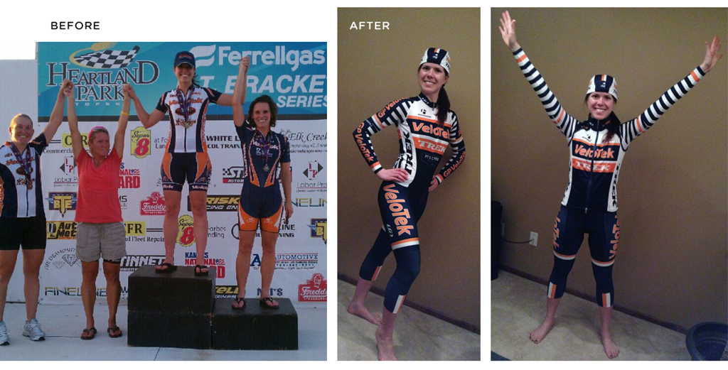
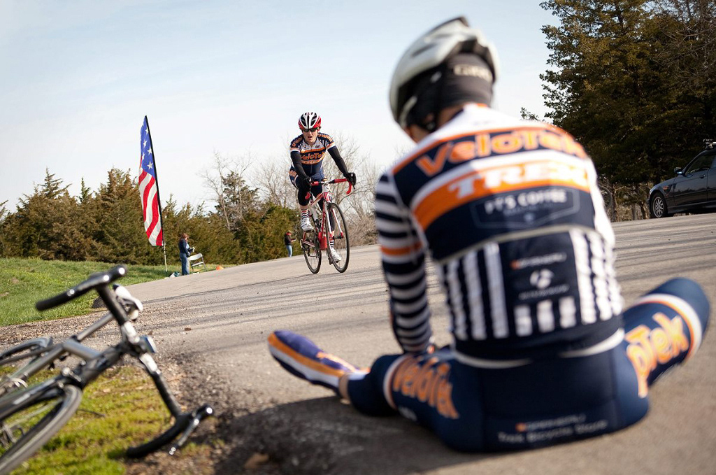
In 2012, I began a top-to-bottom refresh of the brand, including race and spirit apparel, to enhance visibility in the pack and on the road.
Solution
I spend a lot of time in the saddle surrounded by fellow riders clad in a variety of colorful graphic combinations printed on Lycra. It’s like a front row seat in a focus group where I'm the client and art director. I knew that a sharp, smart uniform could make a big difference for a member of any team or organization, and I was particularly motivated because, at the time, I was designing for friends, teammates and myself.
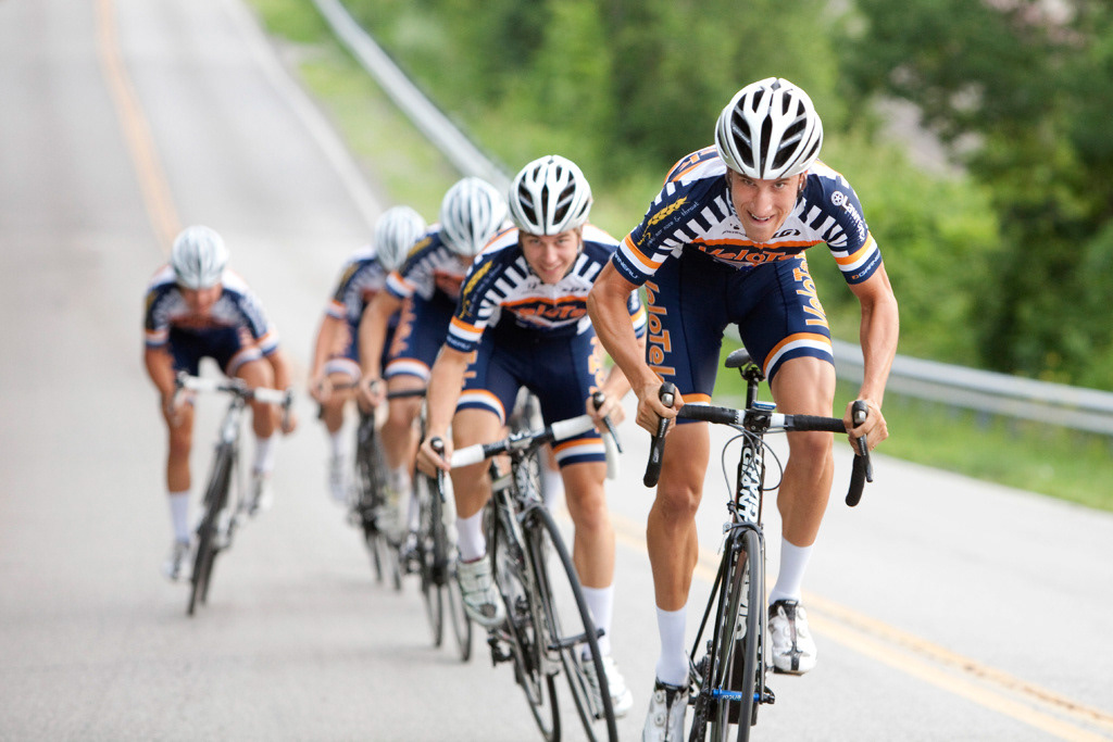
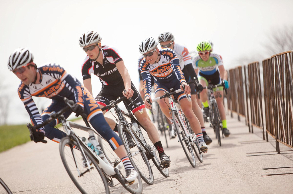
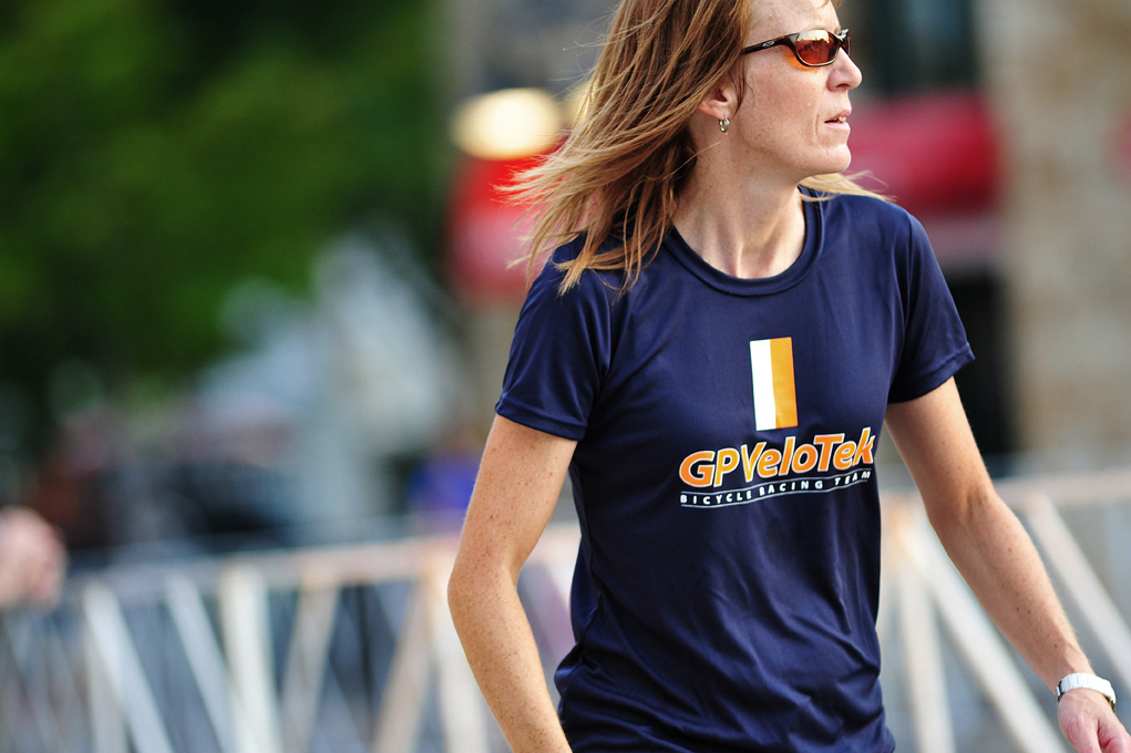
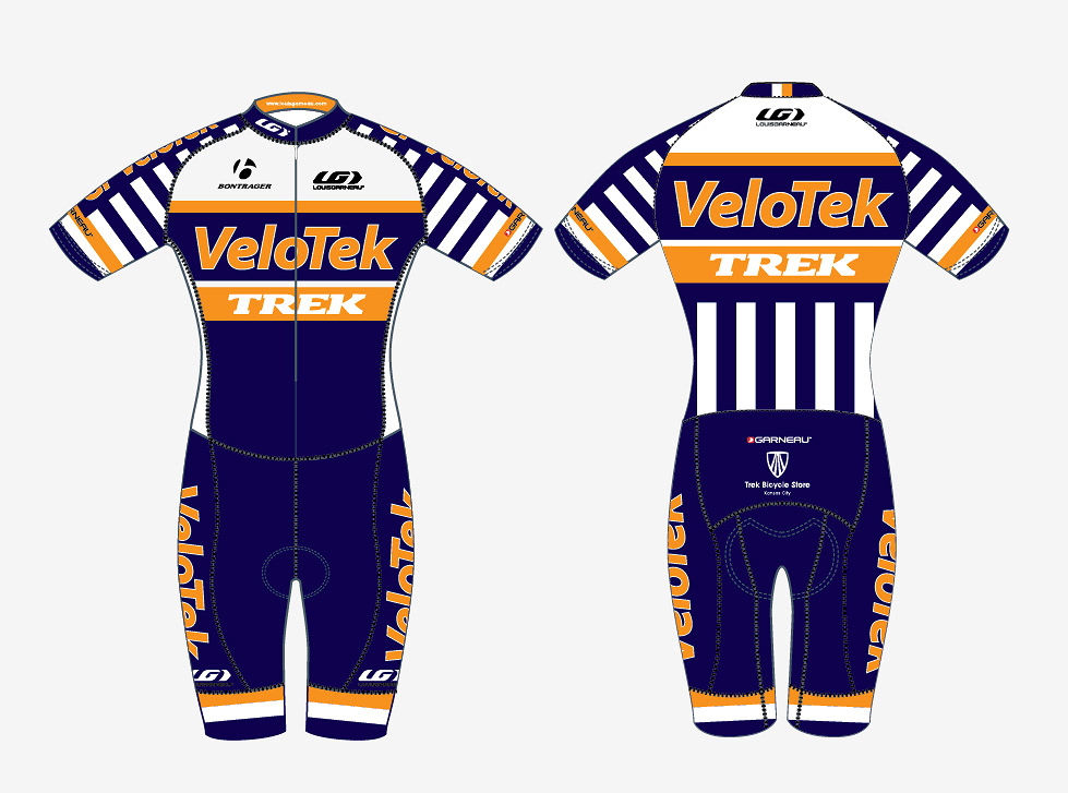
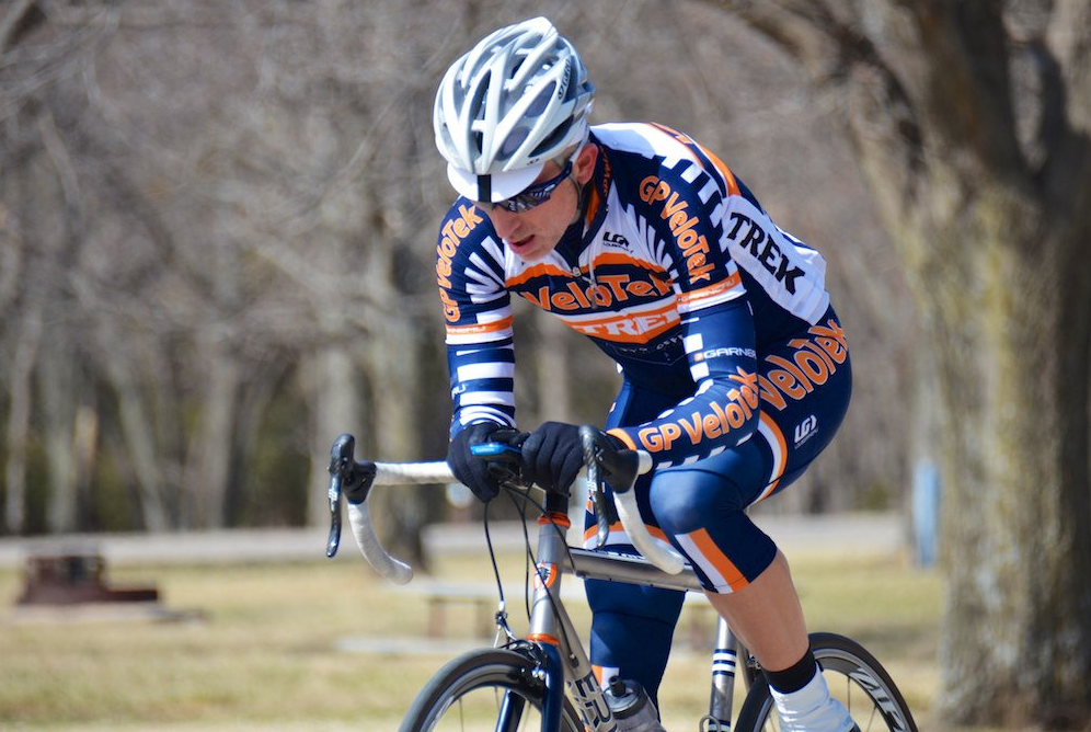
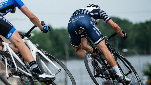
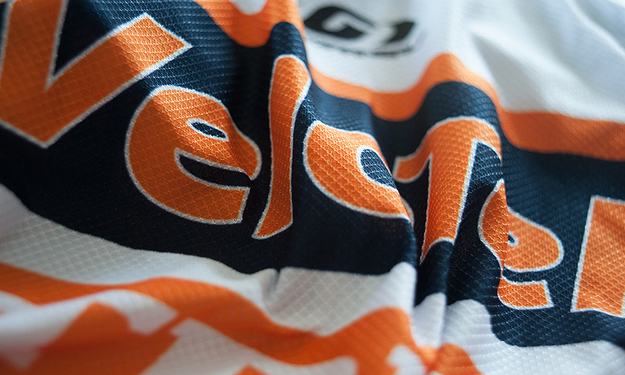
VeloTek had a decade’s worth of equity in the navy, orange and white palette, and there was no reason to change it. But I knew that the colors could be utilized more effectively in a more flattering way, particularly for the women’s team. Previous graphics enhanced hips on the women and bellies for the men, so I focused on slimmer fields of color and patterns.
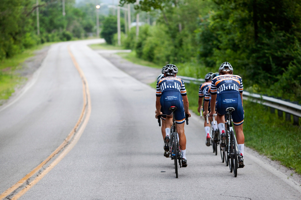
Historically, few domestic or pro squads have used stripes in the modern era, but more teams did in the early 20th century when graphic patterns were the only identifiable marking on jerseys, much like knights of old.
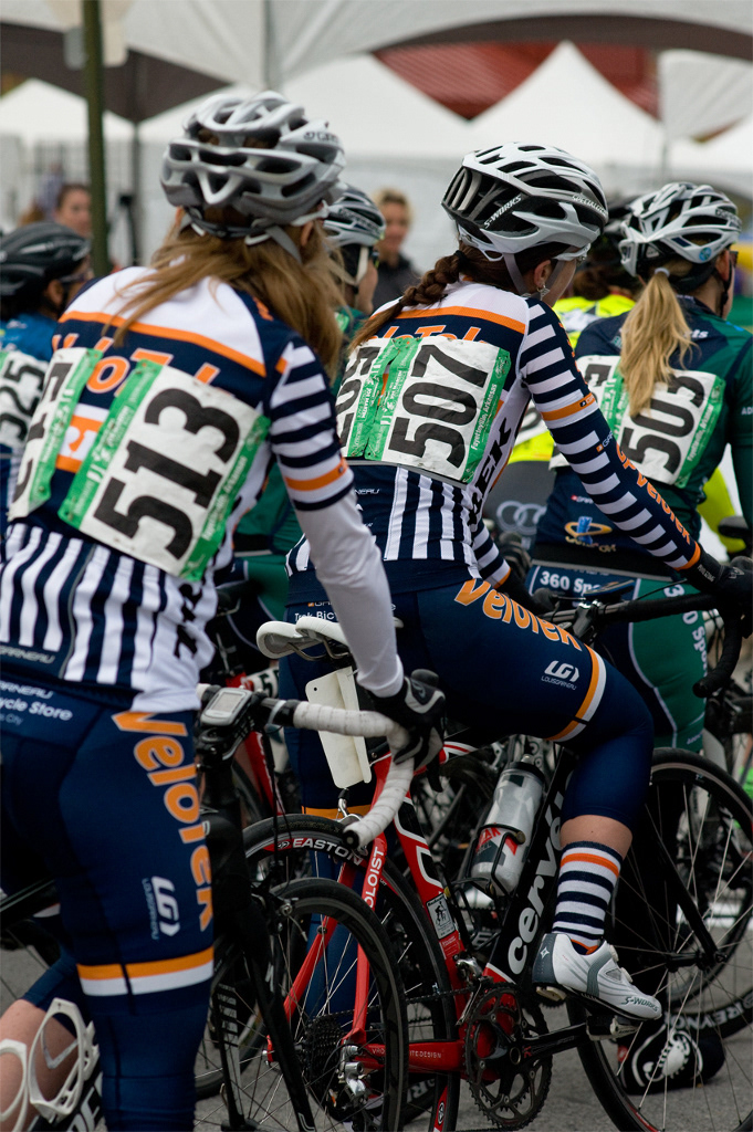
A navy and white striped pattern, an iconic fashion combination, was used on the sleeves and rear pockets for maximum impact and recognizability. Because cyclists train more than they race, it’s important to be visible to motorists, particularly in the evening hours when most ride after work. In races, those two areas are the easiest to see when teammates are looking for each other in a speeding pack. The pattern also makes it easier for friends to pick out VeloTekkers from the roadside.
Dark navy was used on the shorts and torso for a slimmer effect, and white was used on the upper chest and shoulders to keep riders cooler on hot days. Orange was used as an accent color, which made it more effective in typographic executions.
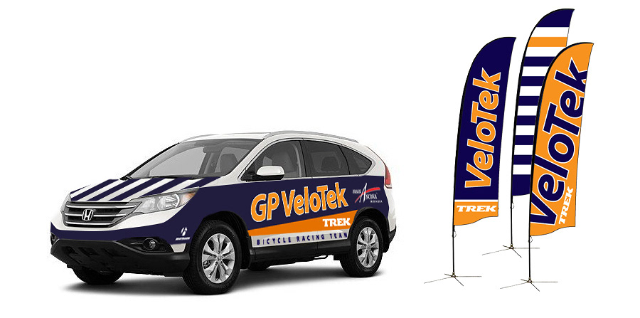
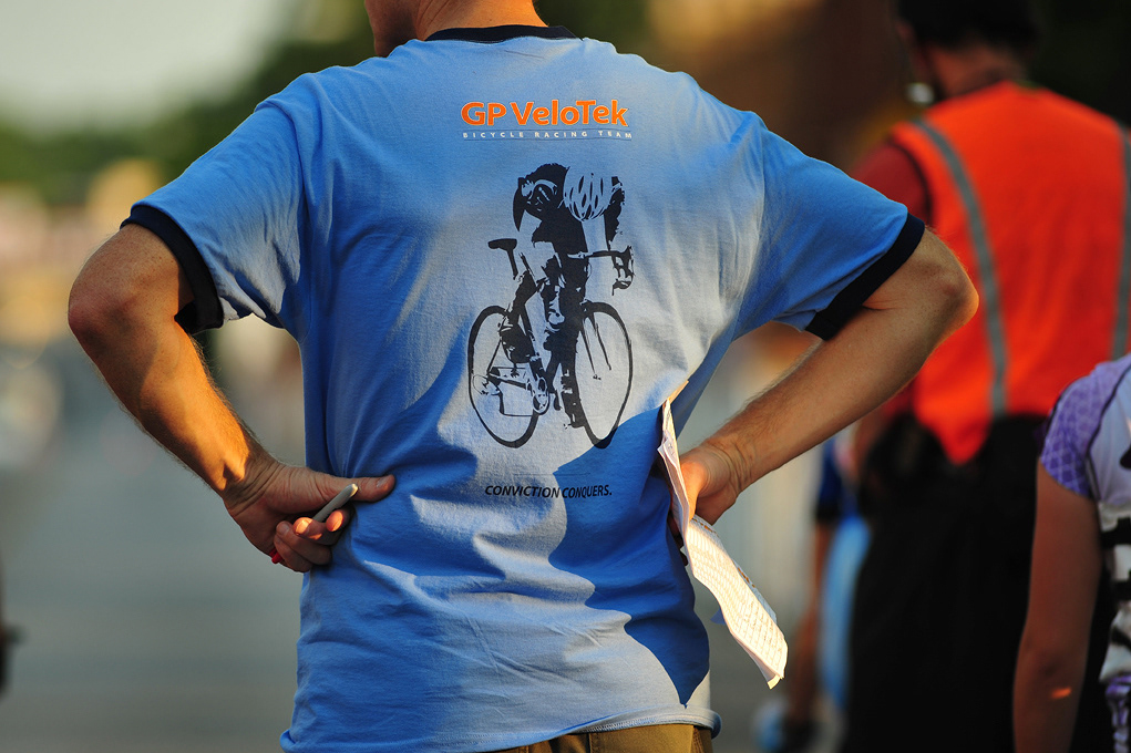
The styling and thinking was applied to a full brand extension—all race and training wear, signage, tents, vehicle graphics, print and digital media, and social channels.
Art direction and design // Chris Ralston
Photographers // Chris Ralston, David Tjiptogarsono, Wirken Photography