Background
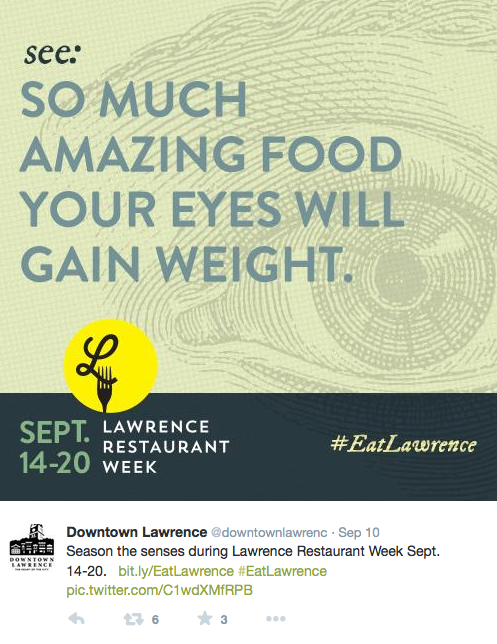
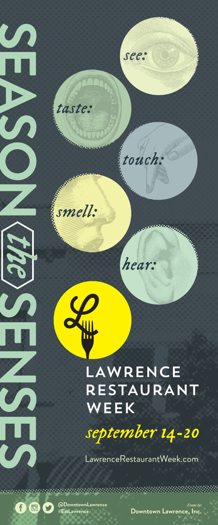
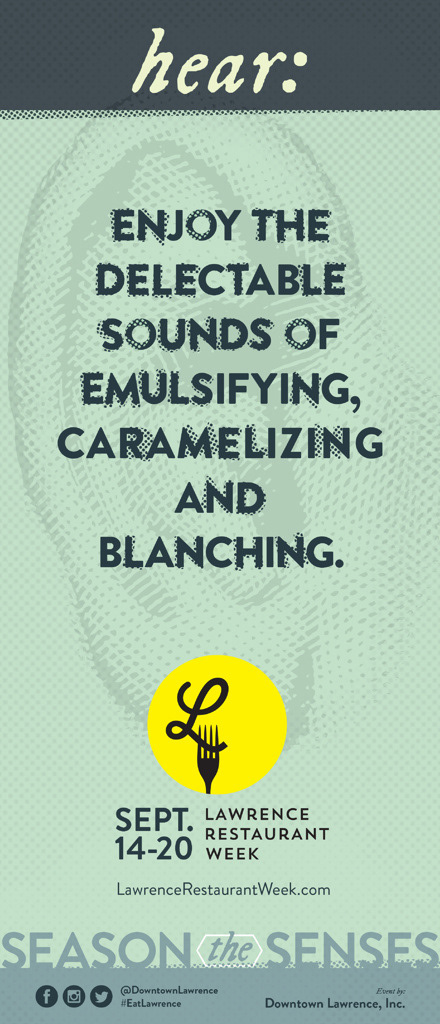
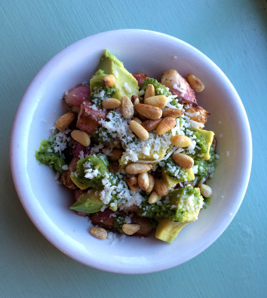
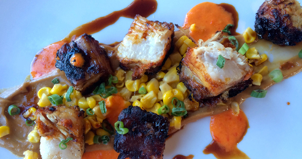
Downtown Lawrence, Inc., launched Lawrence Restaurant Week in 2014 to showcase the diverse and expansive menus of downtown eateries. Callahan Creek developed a print and social media campaign in support of the event.
Challenge
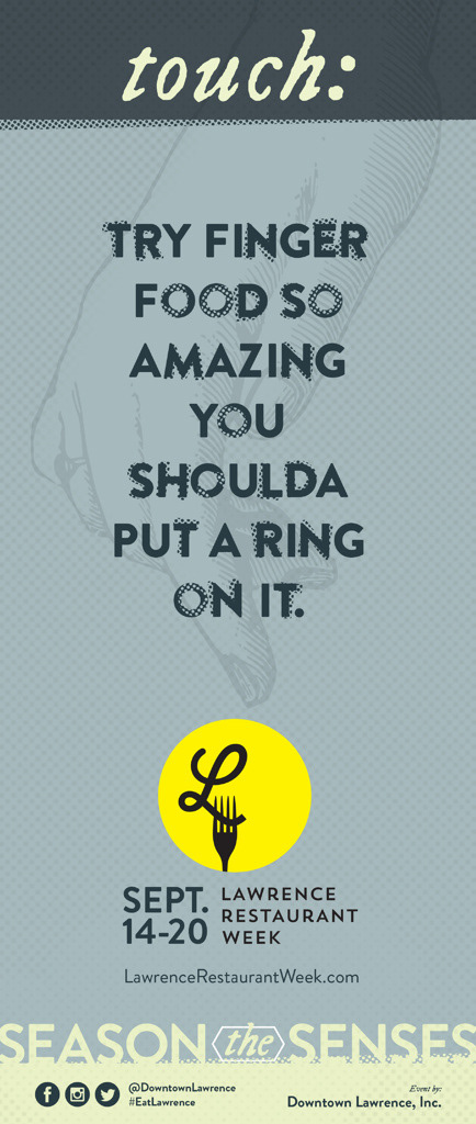
Because 2014 was the inaugural year for Lawrence Restaurant Week, the goal was to develop a simple, iconic, timeless mark that would have lasting value. The logo also would need to work with a different campaign concept each year and stay within a very limited budget.
Solution
Logo concepts were developed in a creative department shootout, and one of my marks was chosen by Downtown Lawrence, Inc., board members to lead the campaign.
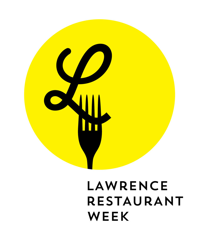
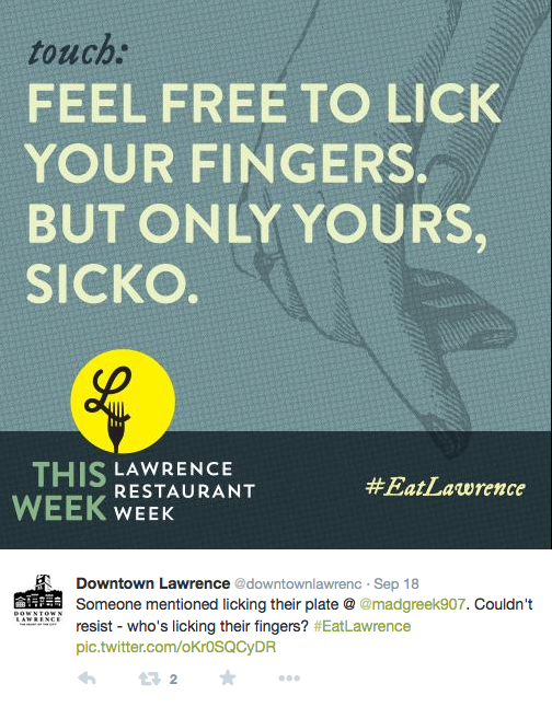
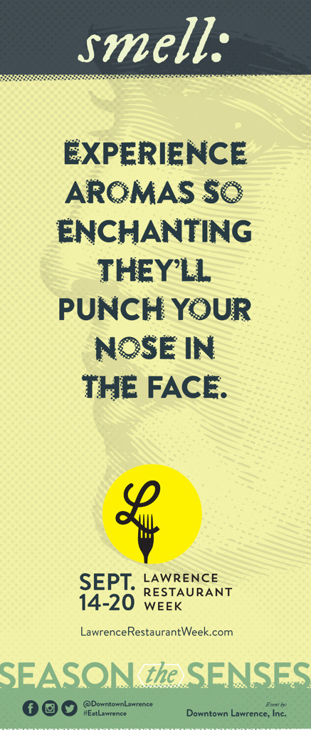
The mark connects Lawrence and food through typography (the script “L”), and the fork shape gives it stability and visual movement. The yellow circle represents a spotlight on Lawrence restaurants and a blazing September sun. The L and fork inside circle are set just to the left of center because the vibe in Lawrence is slightly left and weird (in all the good ways). The L also represents “local” and a loopy noodle because most downtown restaurants serve some form of pasta as a staple. Many civic institutions in Lawrence use the Futura typeface in signage, so a Futura revival was used for the wordmark.
Awards // AAF Kansas City, Silver ADDY
Identity design // Chris Ralston
Collateral development and design // Dustin Sharp and Sonya Collins
Creative direction // Stefan Mumaw
Writer // Tug McTighe
Collateral development and design // Dustin Sharp and Sonya Collins
Creative direction // Stefan Mumaw
Writer // Tug McTighe