Background
In late 2013, we began a comprehensive study of PROSOCO, a national manufacturer of products for cleaning, protecting and maintaining concrete; making buildings air- and water-tight; and cleaning, protecting and restoring new and existing masonry buildings.
Challenge
Months of qualitative research confirmed that the company's emphasis on exceptional customer service was working. Architects, contractors and distributors across the country not only trusted PROSOCO’s products, they actively endorsed them. We used that foundation to help PROSOCO erect a top-to-bottom refresh of the entire organization. In their eyes, it was a rebirth, not just a rebrand.
We began with a detailed strategic recommendation that included each product division. Because their sub-brands had significant equity and recognition, we were challenged to breathe new life into the parent brand without diluting the success of the sub-brands. We also developed a communication strategy that focused specifically on language, transparency and the strong relationships that the company had built during the years.
Solution
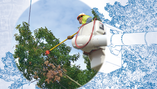
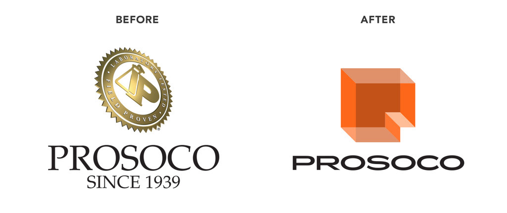
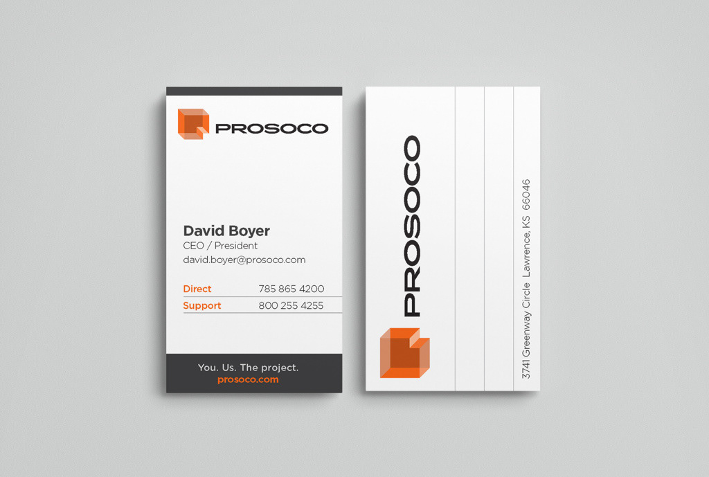
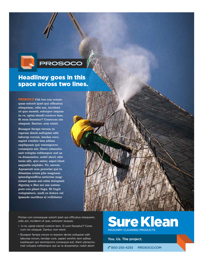
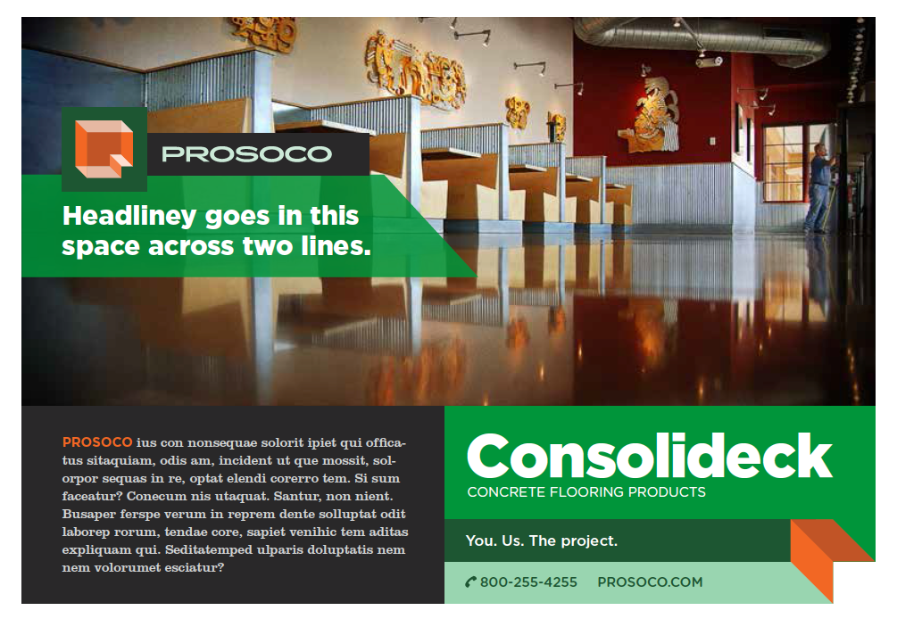
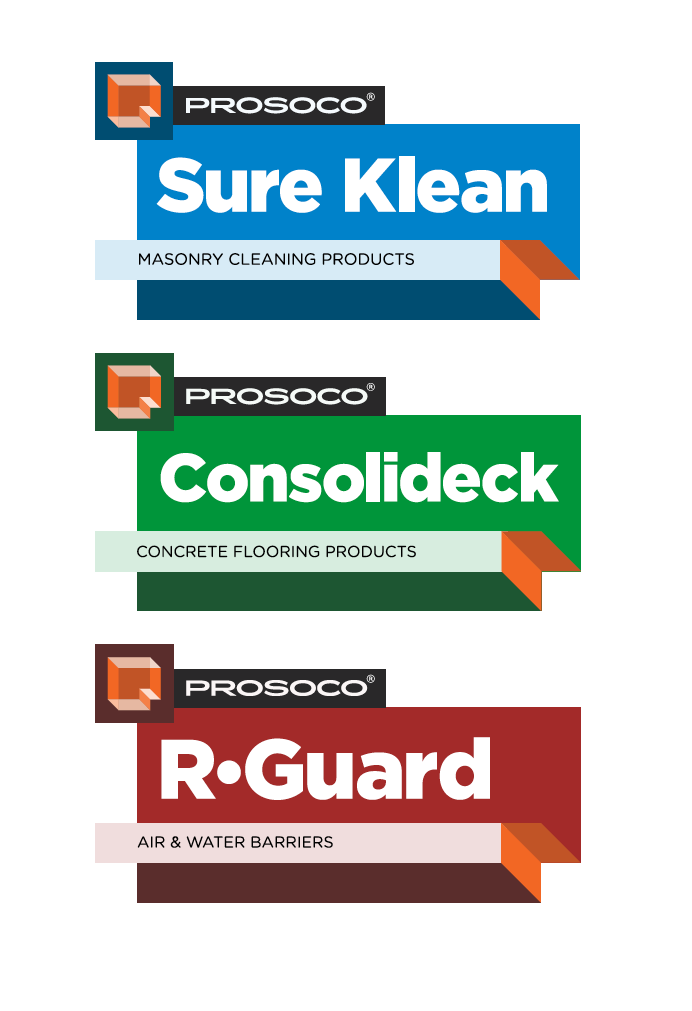
All of this infused the creation of the new visual identity, which borrows elements from PROSOCO’s rich history—the letter “P,” the color orange and its connection with the building industry. But the key conceptual element is the fact that PROSOCO stands behind its customers, often solving problems with them in the field. The new identity mark began with two “P” shapes that also resembled heads in profile. When overlapped and connected, they become structural, dimensional and transparent.
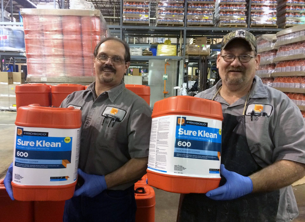
The modular visual language informed development of the sub-brand identities, which were reborn with color palettes that better distinguished them from their competitors. Because these products have the greatest impact on pallets at job sites or on the back of trucks, all packaging containers now are orange for enhanced recognition. The product labels have a more clear hierarchy of information and QR codes that link to application and safety instructions for contractors who these days rely more and more on their smartphones.
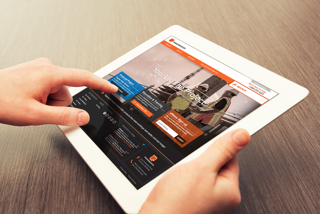
Our work extended to a new website that allows customers to better source PROSOCO's deep product lines. We also helped the company develop a bold new footprint at trade shows across the country in 2015 that is inspired by the transparent orange shapes in the new identity.
Art direction and design // Chris Ralston
Writer // John Carlton
Account direction // Sarah Miller and Isabel Manalo
Web design and development // Derek Dighton
Writer // John Carlton
Account direction // Sarah Miller and Isabel Manalo
Web design and development // Derek Dighton

Epilogue / A “go bag” for client presentations
When we presented logo designs to Prosoco, Creative Director Stefan Mumaw and I had been working for weeks on two directions, he designing one and me the other. The challenge involved a refresh of the parent brand and three sub-brands that had more market equity.
We had strong foundations for our work. Our research director had successfully presented his findings a month before, and his conclusions were well-received. Every visual choice we developed was supported by the research, and we felt like the client would have a tough time choosing between our marks.
Stefan is a master presenter and artfully crafts digital decks that tell the story of the work. The Keynote presentation that he built for the client seemed bulletproof, and we were excited to take the client through it.
We found out the day before that the room would include nearly 20 people, all of whom would have a voice in the decision-making. This made me nervous, but Stefan was unfazed. The show went on and seemed to go over really well with the audience.
The hammer fell a few days later.
The feedback was confusing and contradictory at times, but the verdict was final—neither mark was accepted. We were asked to start over and return with new work.
This was a gut check for the account team because budget was tight, and we had over-delivered already. There was talk of leaving our original work on the table and declining to do additional exploration without a budget accommodation, but I took it personally.
I wanted to win.
And that meant delivering a mark that they not only approved, but loved. This was important because it was a family-owned company with a lot of inherent pride from top to bottom in the organization.
Stefan agreed to let me take one more crack at it. It’s tough to ignore design paths you’ve explored before in situations like this, but it helped to go back to the research.
Somewhere in the findings, I saw something new that inspired me. But what we decided to do differently this time was request that the audience be reduced to only the key decision makers, which were the two owners. And we were only showing sketches, not finished work, so that we could get a better sense of what they wanted.
This eliminated a slick digital interface on screen and brought them into the down-and-dirty process of making a thing with pen and paper first.
I’ve always favored presenting across a table instead of in front of an audience. It removes the theatrical nature of a presentation and makes it more of a conversation between partners, which seems more comfortable and honest.
The owners seemed to like this approach and although they favored the new sketches, they weren’t quite sold. I could sense the meeting slipping away. It wasn’t until I reached into my bag and handed one of them a Sharpie and a sheet of tracing paper that the tide turned.
Actively listening and including them in the making of their mark made all the difference. We were able to draw our way out of a jam together, which smoothed future meetings because there was higher level of trust between us.
When I returned a week later with color renderings, I knew they already had taken ownership of the mark. One of the owners went to office and returned with a pair of scissors, which he used to cut out the new logo so he could better imagine it on his shirt.
The office adage that you should never show up for a meeting without a notebook and pen holds true. For designers, though, I recommend a “go bag” with at least a Sharpie, a pair of scissors, a pad of tracing paper and some copy paper.
Those tools might just save the day, a project and a client relationship.