Background
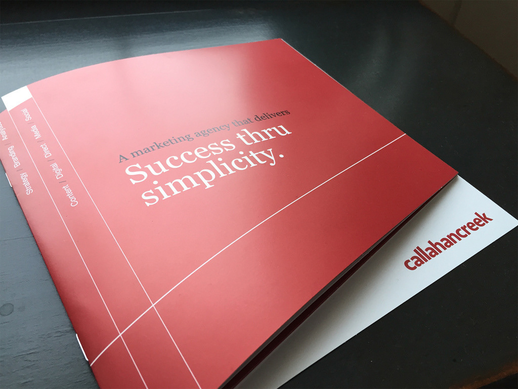
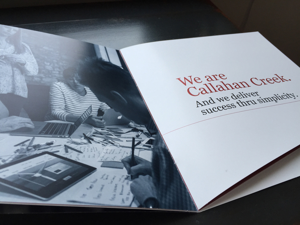
Callahan Creek changed ownership and positioning in early 2015. Although the agency still targets specialty brands, its thrust is “Success Thru Simplicity,” which builds on more than 30 years of crafting unique strategic solutions to client problems. With the addition of analytics, the agency now offers a way to measure those solutions.
Challenge
The project began with a call to solve brand inconsistency across channels, particularly digital presentations, email and case studies. Because more hands were crafting agency materials, new interpretations were diluting the overall impression.
Solution
A team of three was assembled to examine inconsistency issues, but we proposed taking it further and better aligning it with the new mission of “Success Thru Simplicity.” Leadership bought into the idea, and I led and developed an across-the-board brand revision, beginning with a capabilities booklet that was sent to new business prospects.
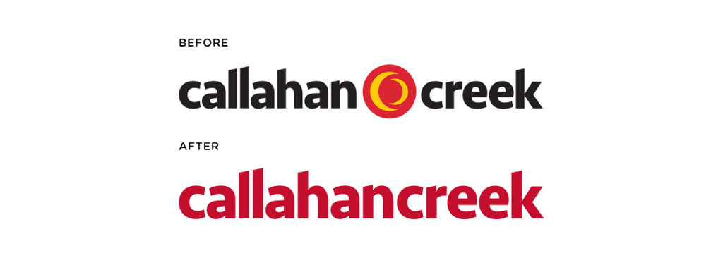
Work began with the logo and wordmark. Because the previous “twin moons” icon lacked conceptual basis or a story, it was dropped and the words Callahan and Creek were pushed together to make one word, which is how it’s spoken. This created a more ownable name and simplified brand expression.
The color yellow also was dropped from the corporate palette because we struggled to maintain vibrancy in print executions. A deeper shade of red with a metallic equivalent was chosen, and black and shades of gray were retained. Blue and a metallic companion were added as secondary colors, which created a more premium, sophisticated impression.
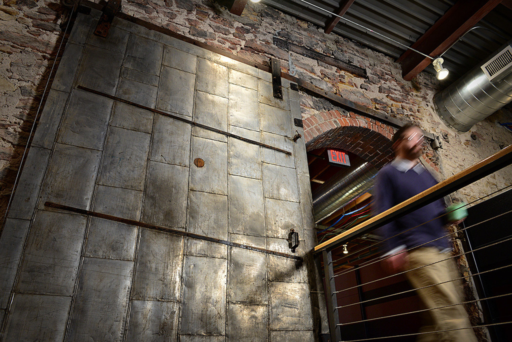
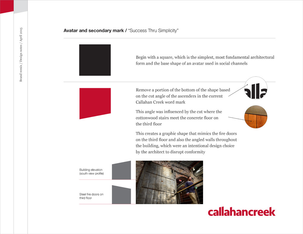
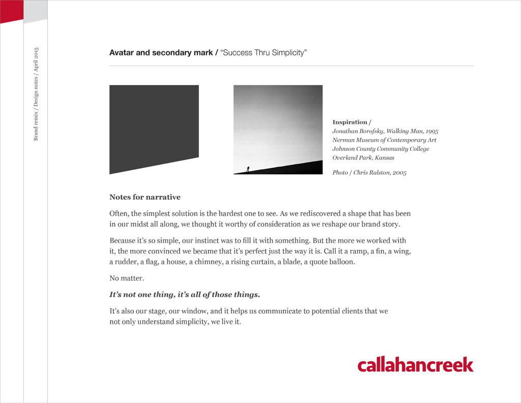
Inspired by angles in the office architecture, I customized the typeface used in the wordmark in 2010. I revisited that idea and discovered a shape that not only is common throughout our space, but that also can form a narrative and become a structural and defining graphic element in all communication channels.
Art direction and design // Chris Ralston Creative direction // Stefan Mumaw