Background
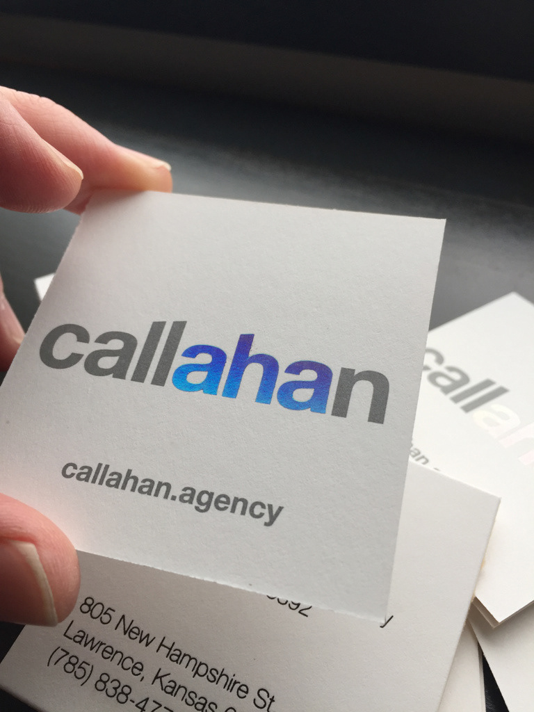
Callahan Creek officially became Callahan in 2018. To enhance the data-inspired creativity message, we highlighted the "aha" in our name and made it a feature of the rebrand.
Challenge
The idea of using business cards in the digital age—let alone developing a premium card—was a tough sell to the executive team, particularly as we embarked on a renovation of our building interior.
Solution
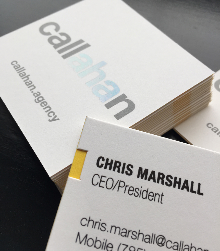
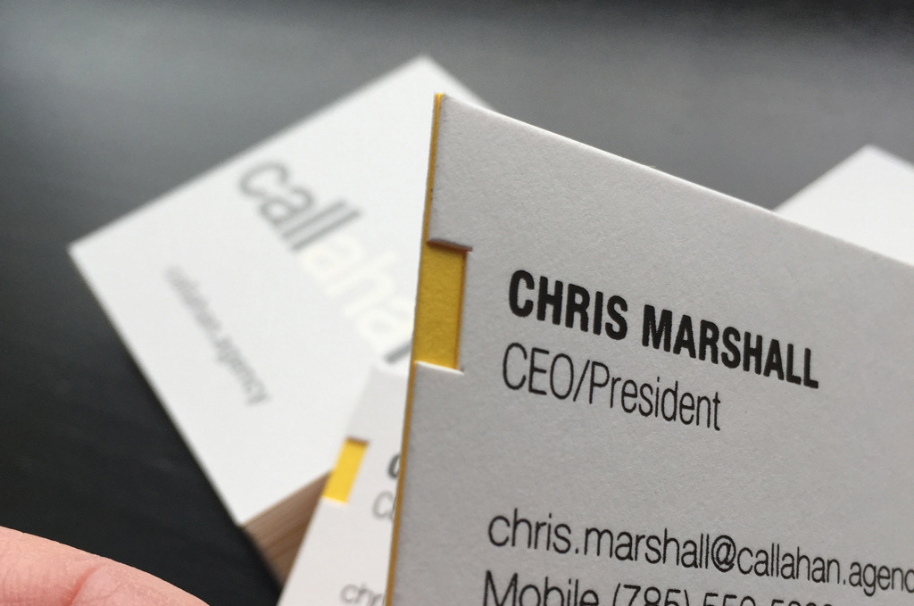
I convinced them that our brand repositioning and focus on "aha" in everything we do was precisely the time to produce a business card that made a strong impression. At the conference room table, I dropped a traditional business card and asked them to note the sound it made. The thin stock hardly registered a whisper. Then to I threw down a laminated card made of double-thick cover stock. It landed with a WHUMP, and they were sold. The "aha" was stamped with holographic foil to ignite a conversation between giver and recipient. The back of the card also was foil stamped in matte brown to create a tactile impression. A die-cut notch was cut on one side to reveal the yellow side of the double-thick cover stock and highlight the employee's name and title.
Cards were produced in small quantities, and staff were encouraged to present them like a gift to people they most wanted to impress.
Art direction & design // Chris Ralston
Printing and stamping // BrightMarks, Lenexa, Kansas