Background
Bryan Sherwood of Kentucky Typer is a typewriter enthusiast, collector an trusted repair expert. As an avid typewriter collector and daily user, I've sent Bryan several machines for refurbishment the past few years. He performs small miracles—often—to keep these mechanical marvels and working artifacts in use for generations to come.
Challenge
Bryan was arm-deep into a 1930 Royal portable of mine and wondered if I could share my branding skills in service of his business. He wanted a fresh logo and trusted my judgment, giving me very little direction. It was a privilege to help him out.
Solution
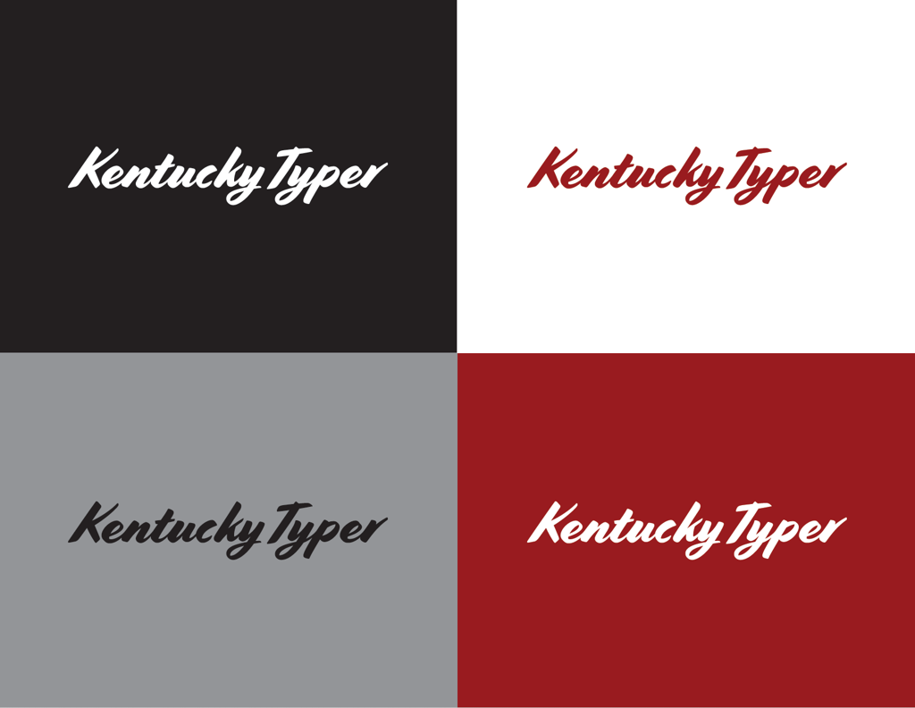
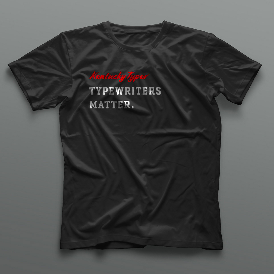
A typewriter typeface was too obvious and cliche. Instead, I focused on the human element.
From my presentation to him:
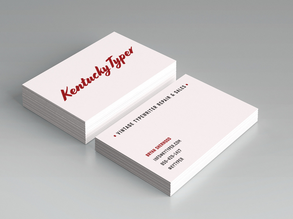
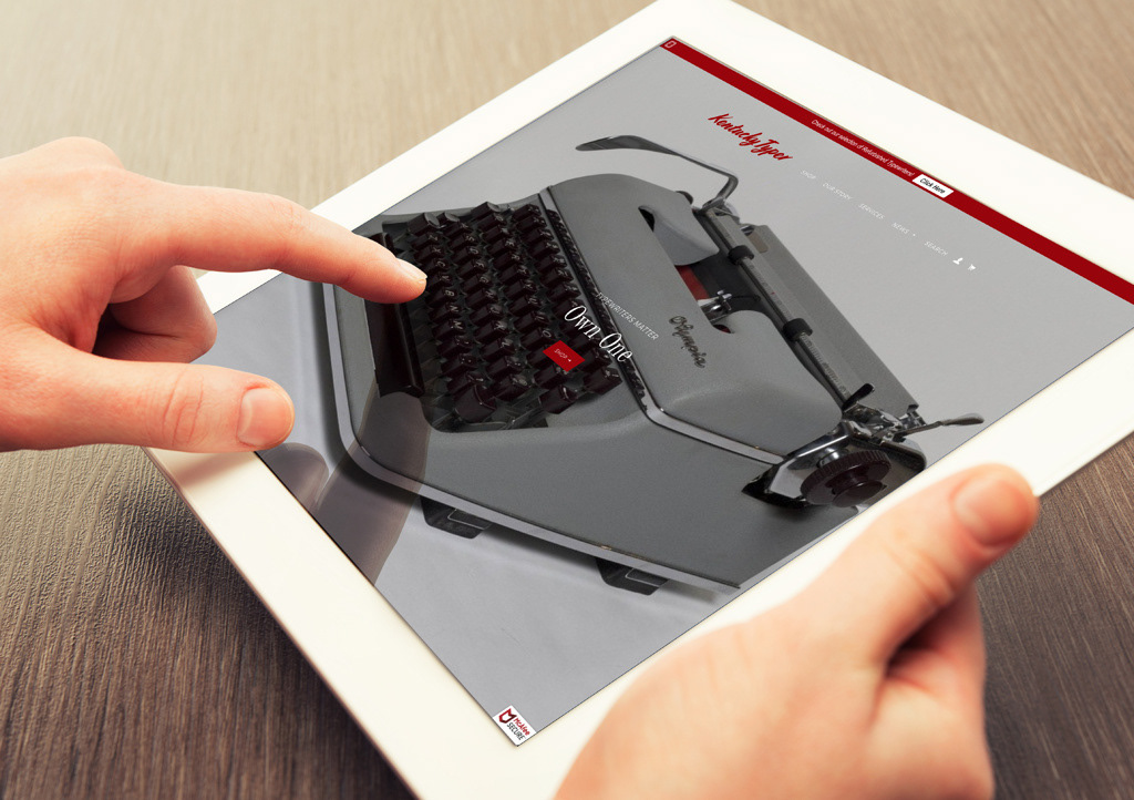
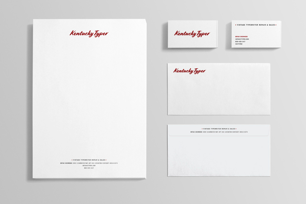
Your business is made by the skill of your hands and sealed with a handshake (often a virtual one, in this Internet age). The typewriters you service are one of the finest examples of the mechanical engineering ever developed. But the machines are not cold or abstract. They are an extension of the human hand, a precise tool for communication. This idea led me to consider sign painters as inspiration. Their work, like that of typewriter repair, is a lost art. Yet, the impact of their work can convey more impact, more honesty because it’s rendered with hand and brush. Ironically, those are among the same tools you use in restoring typewriters. Typeface: Cortado Script, designed by designer/educator Ben Kiel, St. Louis, Mo. Based on the pointed brush lettering of illustrator Cecilia Carlstedt. Traits: Emotion and motion. Honest, human, simple, connected, 20th century, warm. Function: Reads well in large and small sizes, in print and on the web.
Art direction & design // Chris Ralston